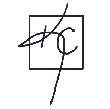
PERSONAL BRANDING
Programs Used: Adobe Illustrator, Adobe InDesign
Project Purpose: Personal Brand Identity
Year Created: 2023
In a crowded marketplace, the most important thing a designer needs to separate themselves from competitors is having branding that has a powerful first impression. I am a growth oriented, balanced, and creative person that highlights adaptability and it was important to me that my branding represents that.
Process Work
Typography
As a designer who brands themselves with adaptability, I decided to chose the typeface Avenir Next because of its clean, adaptable nature that suits various scenarios.
Color Palette
Green represents new beginnings, growth, and stability. I personally describe myself as a green person. I am a growth orientated, adaptive, balanced, and creative person. I feel there was no better option when choosing green as the main color of my branding.
HEX #000000
RGB 0 0 0
CMYK 0 0 0 100
HEX #567A26
RGB 86 122 38
CMYK 69 32 100 17
HEX #FFFFFF
RGB 255 255 255
CMYK 0 0 0 0
Sketches
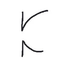
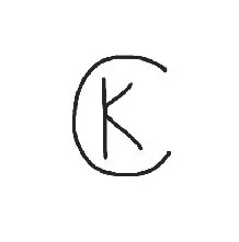
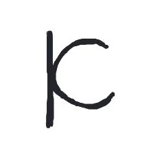
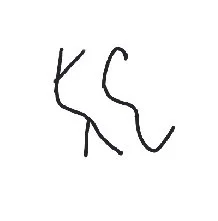
Sitting down jotting down ideas for new projects is easy. Deciding which sketch is the best is the hard part. All nine of these could work very well to showcase my brand but only 1 was the best option. Only 1 could have the opportunity to easily separate me from others.
Digital Iterations
With the first iteration is was trying to highlight my illustrative side turning the “KC” into a steam with a leaf which then loses the monogram aspect of the mark. The type used turned out very aggressive. This mark ultimately wasn’t the best representation of myself in my branding.
With the second iteration I started to move in the right direction but instead of the type being aggressive the “KC” was too aggressive with the scale. The dot in the middle of “Kenzie Calvin” could allow viewers to misinterpret my name assuming “Kenzie” and “Calvin” were the last names of 2 people which is not what I was looking for.
The last iteration I dialed every thing back into a perfectly balanced logo that best represents my brand. The monogram, the color, and the typeface together represent balance, symmetry, adaptability, and showcase a straightforward logo.
Final Iteration
The final piece is the last iteration but with the correct color contrast. The color in the last iteration had a 3:1 color ratio to white while this hue of green has a 5:1 ratio.
The evolution of my branding symbolizes balance, symmetry, and a clear identity making sure I stand out from competitors.


