TESLA MAGAZINE
Programs Used: Adobe Illustrator, Adobe InDesign
Project Purpose: Create a 2 page magazine spread
Year Created: 2023
The purpose of this piece was to take an already published article and turn it into a 2 page magazine spread showcasing basic layout skills and management skills while navigating a spread. I wanted to create a piece that was visually stimulating, dynamic, grabs attentions, and not only informs but also captivates an audience.
Process Work
Typography
With the typeface I wanted to captivate viewers attention and have visual comfort. I chose Bebas Neue for the title and headers because of its boldness and how the typeface commands attention. I chose Gill Sans because of the softness, readability, and visual comfort it embodies.
Color Palette
For the color palette I wanted to maintain Tesla’s already established corporate color palette.
HEX #000000
RGB 0 0 0
CMYK 0 0 0 100
HEX #D72228
RGB 215 34 40
CMYK 0 71 69 16
HEX #FFFFFF
RGB 255 255 255
CMYK 0 0 0 0
Sketches
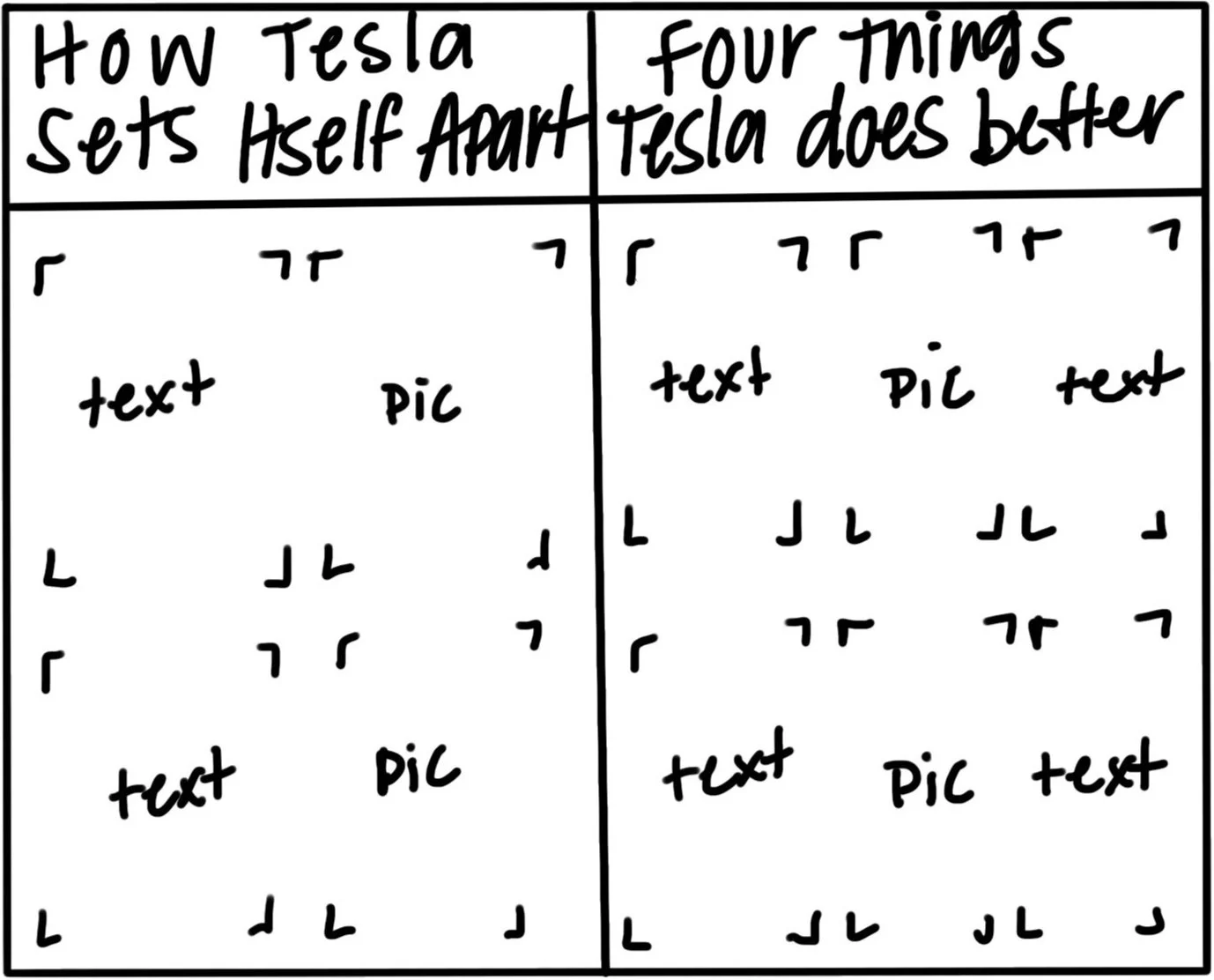
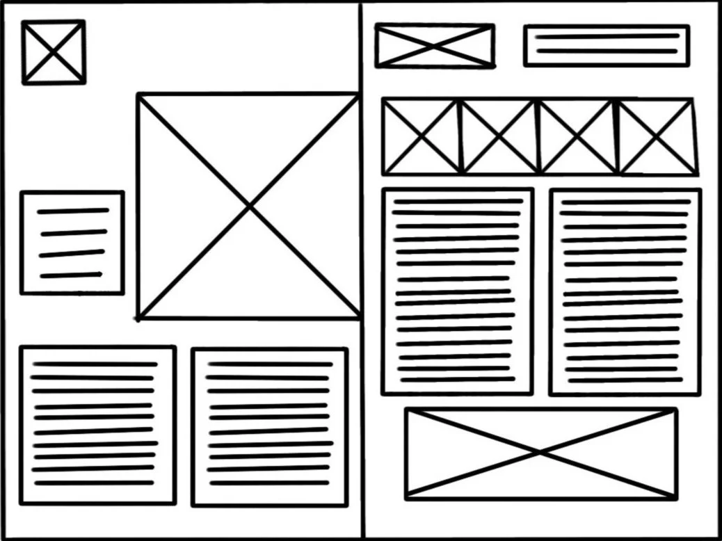
During my sketch session I wanted to make sure I was focusing on which grid and asset placement would be the most successful.
Digital Iterations
The first iteration was mainly focusing on grid. This iteration lacked depth and visual stimulation.
The second iteration I started with a fresh idea. I focused on an easy to navigate grid and started to gain more depth and visual stimulation but the question here was how could I take it even further.
The third iteration I started playing around with visual hierarchy. I played around with different scaling of the 2 headers. I condensed the test and split the second page into four body copies using the icons and headers the separate the topics. This iteration still needing a few alignment fixes within the second page with the spacing of the icons and body copy.
Final Work
Assets
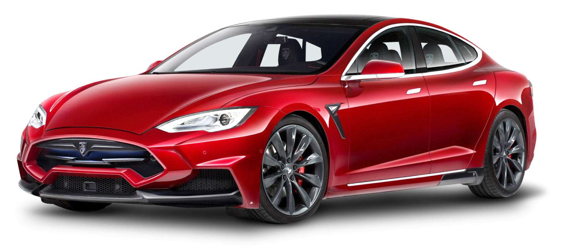
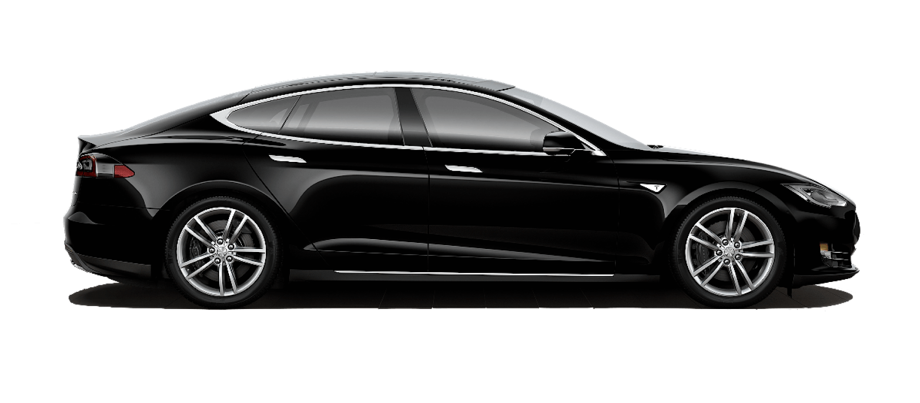
The assets include photographs of Tesla’s manufactured cars, the Tesla logo, and icons that I Illustrated on Illustrator
Final Iteration
The final design consisted of fixing the rivers and widows in the body copy, I added old style numbers, and adding more space in the second page to let the design breath instead of feeling crowded.


